Navigating the Mobile Maze: A Guide to Mobile Web Accessibility
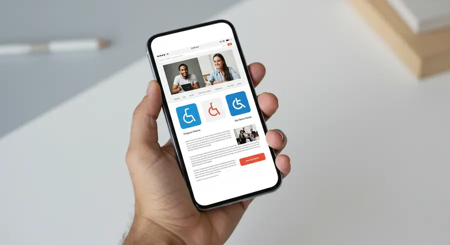
In an era where mobile devices are ubiquitous, ensuring that web content is accessible on smartphones and tablets is not just a best practice—it's a necessity. Mobile accessibility involves designing and developing websites and applications so that people with disabilities can use them effectively on smaller screens, with touch interfaces, and often on the go. This guide will delve into key considerations for making your mobile web presence inclusive and compliant with WCAG principles.

Core Principles of Mobile Accessibility
While the fundamental WCAG principles (Perceivable, Operable, Understandable, Robust) apply universally, their implementation on mobile devices has specific nuances:
- Responsive Design: Content must adapt to various screen sizes and orientations. Text should be resizable, and layouts should reflow to avoid horizontal scrolling.
- Touch Target Size and Spacing: Interactive elements like buttons and links must be large enough to be easily tapped without accidentally hitting adjacent elements. WCAG recommends a minimum target size of 44x44 CSS pixels.
- Keyboard Accessibility (for external keyboards and alternative inputs): All functionality should be operable via a keyboard interface, as some users may use Bluetooth keyboards or switch control devices.
- Consistent Navigation: Navigation menus and controls should be easy to find and use across different sections of a mobile site.
- Understandable Gestures: If custom gestures are used, they must be simple, clearly explained, and have alternatives for users who cannot perform them. Prioritize standard, intuitive gestures.
Key Considerations for Mobile Users
1. Readability and Layout
Small screens demand careful attention to typography and layout. Ensure sufficient color contrast between text and background (at least 4.5:1 for normal text, 3:1 for large text). Use readable fonts and provide ample line spacing. Avoid large blocks of justified text, as they can create "rivers of white" that make reading difficult. For further reading on typography, Google Fonts offers a wide selection of accessible fonts.
2. Interaction and Operability
Mobile interaction heavily relies on touch. Beyond touch target size, consider:
- Pointer Gestures (WCAG 2.5.1): For any functionality that uses multipoint or path-based gestures (like pinch-to-zoom or swiping a carousel), provide a single-pointer alternative (e.g., plus/minus buttons for zoom, next/previous buttons for a carousel).
- Device Orientation: Content should be viewable and operable in both portrait and landscape modes, unless a specific orientation is essential (e.g., a piano app).
- Input Modalities: Support various input methods, including touch, keyboard (if applicable), voice input (e.g., for search fields), and platform-specific assistive technologies.
Learn more about designing for touch and pointer inputs from the Nielsen Norman Group's articles on interaction design.
3. Utilizing Platform Accessibility Features
Both iOS and Android offer robust built-in accessibility features like screen readers (VoiceOver on iOS, TalkBack on Android), magnification, customizable text sizes, and switch control. Web developers should ensure their sites are compatible with these features:
- Semantic HTML: Use correct HTML5 elements (
<nav>,<button>,<main>, etc.) to provide context to assistive technologies. - ARIA Attributes: Use ARIA (Accessible Rich Internet Applications) attributes judiciously to enhance the accessibility of custom controls and dynamic content updates, especially for single-page applications (SPAs). For example,
aria-liveregions can announce changes to screen reader users. - Input Purpose: For form fields, use the
autocompleteattribute with appropriate values (e.g.,tel,email,name) to help users fill out forms more easily, especially those using assistive tech or who find typing on mobile difficult.
4. Performance and Data Consumption
Mobile users are often on metered data plans or in areas with poor connectivity. Optimize images, minify code (CSS, JavaScript, HTML), and leverage browser caching to ensure fast load times and reduce data usage. Understanding market dynamics, particularly through tools that analyze real-time market sentiment, requires similar optimization principles for delivering complex data efficiently.
Testing Mobile Accessibility
Thorough testing is vital. Combine automated tools with manual testing on actual devices:
- Automated Tools: Tools like Axe DevTools, Lighthouse, and WAVE can catch many common issues.
- Manual Testing on Devices:
- Navigate using VoiceOver (iOS) and TalkBack (Android).
- Test with increased font sizes and screen magnification.
- Verify touch target sizes and keyboard accessibility (if an external keyboard can be used).
- Check color contrast in various lighting conditions.
- Test in both portrait and landscape orientations.
- User Testing: Involve users with disabilities in your testing process to get real-world feedback.
For official guidance, always refer to the W3C WAI's WCAG guidelines directly.
Conclusion: Mobile-First Accessibility
Designing for mobile accessibility from the start (a "mobile-first" approach to accessibility) not only helps meet the needs of users with disabilities but also often leads to a more streamlined, intuitive, and user-friendly experience for everyone. By considering the unique challenges and opportunities of the mobile platform, you can create web experiences that are truly inclusive and reach the widest possible audience.
Remember, mobile accessibility is an ongoing journey, not a one-time checklist. As mobile technologies evolve, so too will best practices for ensuring an accessible mobile web for all.